The live heatmap on the homepage is the single feature we get the most reader DMs about. The DMs follow a predictable shape: "why is my hometown glowing?" or, slightly more confidently, "what's happening over [specific city]?"
The honest answer is almost always: nothing is happening. The heatmap is showing you report density, which is a useful thing, but it's not the same as sighting intensity. This post is the short version of why those are different and which layer you want when.
Density versus intensity
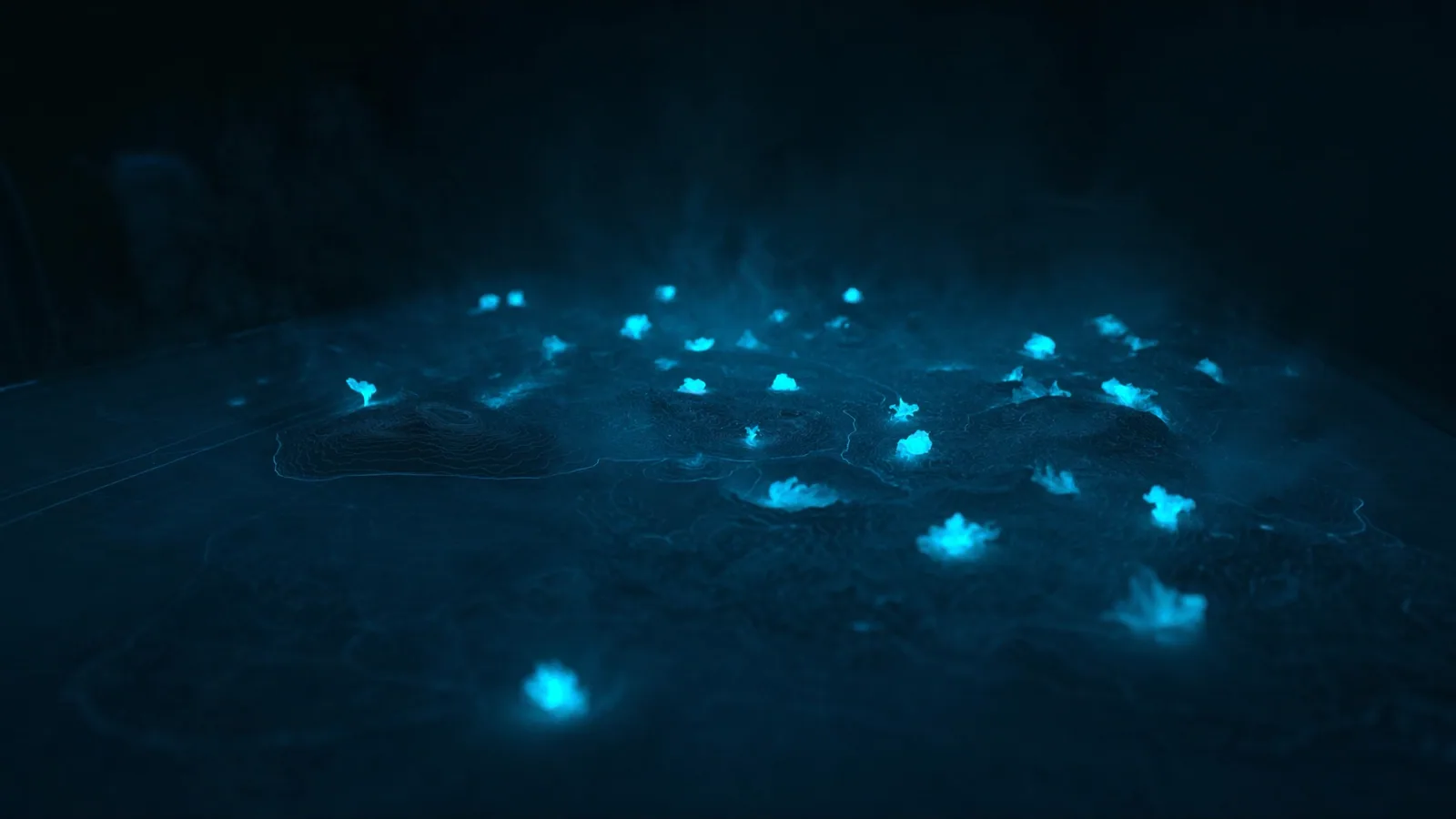
A bright cell on the default heatmap means a lot of reports were filed inside it. It does not mean a lot of high-confidence sightings happened there.
The most common bright cell on any given week is a college town with an active subreddit. Not because more interesting things happen in college towns — they don't — but because the population of people willing to file reports is denser there than in a remote stretch of desert. The desert might be where the genuinely strange stuff is, but if nobody's there to see it, no reports get filed.
This is the fundamental limitation of any user-submitted dataset: the map is showing you where reporting activity is, not where the underlying events are.
The filter that fixes most of this
The filter pane on the live map has a Validated only toggle. It re-renders the heatmap weighted by validation score. The visual effect is dramatic.
Most of the noisy reports — the "I saw a light, idk" filings that don't get corroborated, don't carry media, and don't pull through investigator review — collapse to nothing under the filter. What's left are the genuinely well-evidenced clusters. The map shifts. College towns shrink. Coastal corridors, military airspace edges, and some specific desert regions get more prominent. The story the map is telling changes.
If you're using the map to scout cases worth reading, that's the filter you want to leave on by default.
When density actually is what you want
Default density isn't useless — it's just answering a different question. Density is useful for:
- Community trend-spotting. Where is the conversation happening this week? Where are people paying attention?
- Awareness mapping. If a community is reporting a lot, regardless of validation, that's a signal worth knowing about.
- Recruitment. Investigators looking for active regions to focus on want to see where the activity is, not just where it's been validated.
What density isn't useful for is the question most people ask the map: "what's actually happening in my area?" For that question, flip the filter.
What we're working on
The default-view bias is on our short-list. We're not going to remove the unfiltered view entirely — it's useful for the cases above — but we're testing a clearer first-time-visitor experience that lands you on the validated layer by default. The unfiltered view will be one click away.
If you're a frequent user of the map and you have a strong opinion about which view should be the default, we read everything in research@sighted.com. We're not going to design by Twitter, but we are listening.
